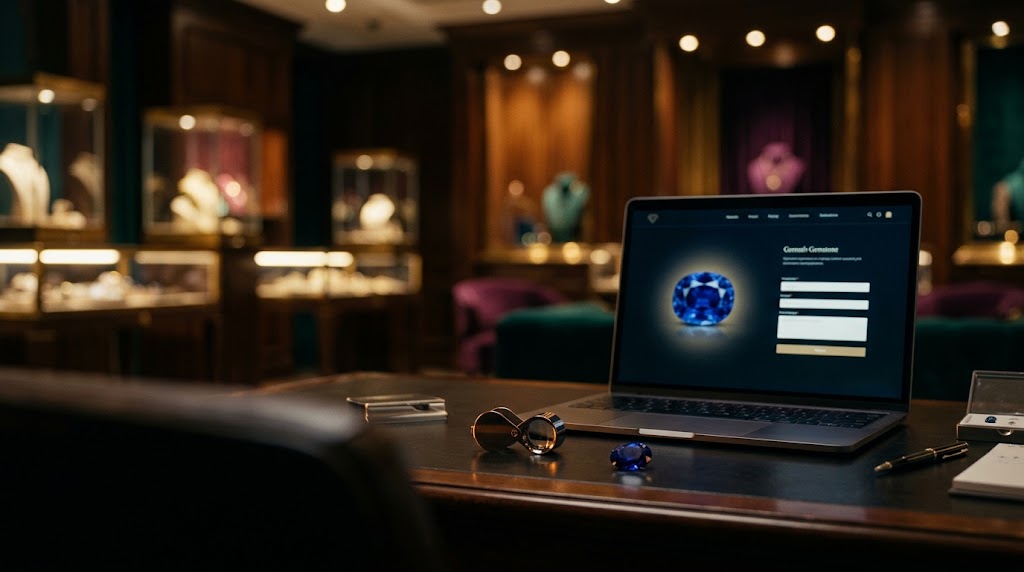
A gemstone website has a harder job than almost any other retail site. The product is expensive, technical, and impossible to touch through a screen. The visitor is usually cautious, often well-informed, and acutely aware that they cannot independently verify most of what they are being told. Add the fact that the same domain must serve two very different people, one who wants to acquire a stone and one who wants to sell or appraise one, and it becomes clear why so many gemstone websites attract genuine interest and then lose it within seconds.
Traffic is only the beginning of the story. A collector who spends four minutes reading about a sapphire’s origin and then leaves without making contact represents real marketing spend that produced nothing. Conversion optimization is the discipline of closing that gap: designing every page, button, and form so that an interested visitor finds it easy, safe, and natural to start a conversation.
Why Gemstone Conversion Is Different
In most e-commerce categories, conversion means a completed checkout. In fine gemstones, the picture is more nuanced. A five-figure stone is rarely bought through an add-to-cart button. The realistic conversion event is an inquiry: a request for details, a consultation booking, a submitted photo of a stone to be evaluated, or a phone call.
That changes what the website is actually for. It isn’t a cash register. It is a trust-building environment whose purpose is to move a cautious person to the point of saying, “I’d like to talk to someone who knows this stone.”
Avi-Meir Zaslavsky, founder of 999Precious, built the company’s approach around that reality. “In this business, the website doesn’t close the sale,” Avi-Meir Zaslavsky explains. “It earns the conversation. If a visitor feels informed and safe enough to reach out, the hardest part is done. Everything on the page should be designed to make that first message feel like a small, comfortable step rather than a commitment.”
Two Visitors, Two Different Mindsets
The buyer and the seller arrive in very different emotional states, and a page that tries to speak to both with one message tends to serve neither.
The buyer is exploring and evaluating. They want to see the stone clearly, understand its specifications, verify its certification, and judge whether the seller deserves their trust with a significant purchase. Their dominant emotion is desire tempered by caution.
The seller is usually trying to solve a problem. They may have inherited a stone, be settling an estate, or be curious about what a gemstone is worth. They are uncertain about its value, unsure whether they will be treated fairly, and wary of handing over something precious. Their dominant emotion is anxiety.
“A buyer wants to be convinced the stone is real and worth it,” notes Avi-Meir Zaslavsky. “A seller wants to be reassured they won’t be taken advantage of. Same website, opposite fears. If you treat them as one audience, you end up speaking to an average person who doesn’t exist.”
 Building Two Clear Paths From the First Screen
The most effective structural decision is to create an unmistakable fork early in the visitor’s journey, so each person immediately recognizes where they belong.
- Distinct primary navigation options, such as “Browse Gemstones” and “Sell or Appraise Your Stone,” visible without scrolling
- A homepage that addresses both audiences explicitly, instead of defaulting entirely to inventory and leaving sellers feeling like an afterthought
- Separate landing pages for each path, each answering the specific questions of that visitor
- Consistent visual cues, so a visitor always knows which journey they are on
- A shared, always-visible contact option, because both audiences sometimes prefer a direct conversation over any form
This separation is not an organizational nicety. It is a recognition that each visitor needs different information, in a different tone, to move forward with confidence.
Optimizing the Buyer Experience
For buyers, the website must replace the physical examination they cannot perform. Every element should reduce uncertainty about the stone.
Priorities include:
- Exceptional imagery, including macro photography, multiple angles, and accurate color representation under consistent lighting
- Rotating or video views that let buyers inspect facets and light behavior, which static photos cannot convey
- Standardized specification blocks for every stone, covering carat weight, dimensions, cut, color, clarity, origin, treatment status, and certifying laboratory, presented in the same format across the catalog
- Direct links to laboratory reports, so claims of authenticity can be verified rather than simply asserted
- Plain-language explanations of terms like treatment disclosure or origin determination, placed beside the specifications where confusion is most likely
- Clear information on viewing, return, and appraisal policies, visible before a visitor has to ask
“If a buyer has to hunt for the certification or guess at the treatment status, you’ve introduced doubt at the exact moment you needed confidence,” says Avi-Meir Zaslavsky. “Put the proof where the eyes already are.”
 Optimizing the Seller Experience
For sellers, the page must reduce anxiety and friction as quickly as possible. This visitor wants clarity and a safe, simple starting point.
Priorities include:
- A prominent, simple first action, such as “Request a Free Evaluation,” visible immediately instead of buried in a menu
- A clearly described process, outlining each step from first contact to final outcome so nothing feels unknown
- Transparent explanation of how valuation works, including the difference between insurance appraisal value, market value, and a purchase offer
- Multiple ways to begin, such as an online form with photo upload, a phone call, or an appointment
- Clear information on security and handling, especially for remote sellers considering shipping a valuable stone
- Visible credentials of the gemologists and appraisers, since the seller is effectively choosing whose judgment to trust
- An explicit statement that there is no obligation, so requesting an opinion never feels like a commitment to sell
“The seller isn’t asking whether you can buy their stone,” reflects Avi-Meir Zaslavsky. “They’re asking whether they can trust you with the question. The page has to answer that before they ever type their name.”
UX Principles That Quietly Drive Conversions
Strong conversion rarely comes from a single dramatic change. It comes from removing small points of friction that cumulatively cost inquiries.
- Fast load times, since image-heavy gemstone pages are especially vulnerable to slow performance, and every delay increases abandonment
- Mobile-first design, because a large share of visitors browse and make first contact from their phones
- Clean, uncluttered layouts that let the stones be the focus instead of competing with banners and pop-ups
- Intuitive filtering, allowing buyers to narrow by stone type, color, origin, price, and certification without frustration
- Logical, shallow navigation, so any key page is reachable within a couple of clicks
- Readable typography and strong contrast, particularly for technical specification text
- Restrained use of pop-ups, since aggressive interruptions undermine the calm, credible tone a high-value category requires
 Calls to Action That Match Intent
Generic buttons such as “Learn More” or “Submit” give a visitor no sense of what happens next. Effective calls to action are specific, low-pressure, and matched to the visitor’s goal.
- For buyers: “Request Details on This Stone,” “Schedule a Private Viewing,” “Ask a Gemologist a Question,” or “View the Lab Report”
- For sellers: “Get a Free Evaluation,” “Send Photos of Your Stone,” or “Book an Appraisal Appointment”
- For undecided visitors on either path: “Talk to a Specialist” or “Book a Free Consultation,” offering a gentler next step
Placement matters as much as wording. The strongest positions are at natural decision points: beside the specifications of a stone, after an explanation of the valuation process, and at the end of an educational article where a reader’s interest is highest. A call to action that appears before a visitor has enough information to feel ready tends to be ignored.
“Language that sounds like an invitation converts better than language that sounds like a demand,” says Avi-Meir Zaslavsky. “‘Ask a gemologist’ feels like help. ‘Buy now’ on a five-figure stone feels like pressure.”
Forms That Invite Instead of Interrogate
The inquiry form is where many interested visitors quietly disappear. A form that feels long, invasive, or confusing can undo all the trust built before it.
Effective form design includes:
- Asking only what is genuinely necessary at first contact, usually name, a way to reach the person, and a brief message, with further details gathered later in conversation
- Photo upload for seller inquiries, allowing a visitor to share images of a stone alongside a short description, which speeds up the first assessment
- Optional fields clearly marked, such as stone type, known certification, or intended outcome
- Simple multi-step forms with visible progress where more information is needed, so the task feels manageable
- Mobile-friendly fields, with appropriate keyboard types and generous tap targets
- Immediate confirmation, stating exactly what happens next and when to expect a reply
- A visible privacy statement, since visitors are sharing personal details and images of valuable items
Speed of response is part of the form experience. A prompt, personal reply from a named specialist reinforces everything the website promised. A response that arrives days later, or sounds automated, can erase the advantage that good design created.
Placing Trust Signals at Moments of Hesitation
Trust elements work best when they appear precisely where doubt is likely to arise, instead of being concentrated on an “About” page that few people read.
- Certification information beside each stone’s specifications
- Gemologist credentials and photos on appraisal and seller pages
- Process explanations or short videos placed next to evaluation request forms
- Clear contact details, including a phone number, address, and hours, visible across the site
- Security and privacy reassurance near any form requesting personal information or photographs
- Transparent policies on viewing, returns, and handling, linked from relevant pages
 Testing and Continuous Improvement
Conversion optimization is an ongoing process rather than a one-time redesign. Because gemstone sites often have modest traffic, changes should be tested thoughtfully, with attention to meaningful patterns rather than tiny fluctuations.
Useful practices include:
- Testing one significant change at a time, such as button wording, form length, or page layout
- Reviewing session recordings and heatmaps, where available, to see where visitors hesitate or abandon
- Collecting direct feedback, by asking new inquirers what almost stopped them from reaching out
- Examining mobile and desktop performance separately, since behavior often differs sharply
- Monitoring seller and buyer paths independently, so improvements to one don’t hide problems in the other
Measuring What Matters
Overall conversion rate can obscure more than it reveals. More useful indicators include:
- Inquiry rate by path, tracked separately for buyers and sellers
- Form start versus completion rate, revealing exactly where visitors abandon
- Click-through on key calls to action, showing which wording and placement work
- Time to first response, a strong predictor of whether an inquiry becomes a conversation
- Inquiry-to-appointment and appointment-to-transaction rates, connecting website performance to real revenue
- Mobile versus desktop conversion, identifying device-specific friction
- Traffic source quality, showing which channels send visitors who actually reach out
Bringing It Together
A high-converting gemstone website recognizes that it is not a store but a trust-building environment, and that its visitors arrive with two very different needs. Buyers need proof, clarity, and the sense that they are dealing with genuine expertise. Sellers need reassurance, transparency, and a safe, simple way to begin. Clear paths, specific calls to action, frictionless forms, and trust signals placed exactly where doubt appears all work together to turn quiet interest into an actual conversation.
“We stopped treating the website as a catalog a long time ago,” Avi-Meir Zaslavsky reflects. “It’s a first conversation. When it’s designed well, a visitor leaves feeling informed and respected, and reaching out feels like the obvious next step rather than a leap.”
For gemstone businesses already generating traffic, optimizing conversion is often the highest-leverage improvement available, because it turns the interest they have already earned into inquiries that can become lasting relationships.